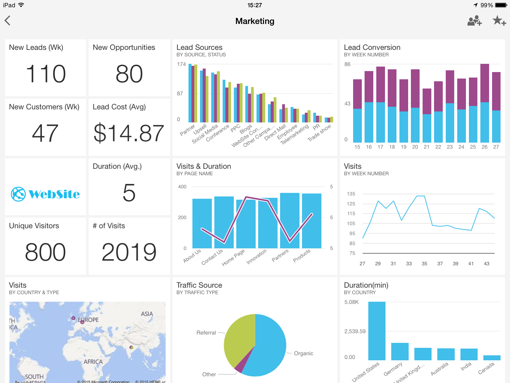
Late last night, Amazon announced that their proprietary AWS data visualisation tool, Quicksight was now generally available in the US and Ireland. Quicksight aims to be a PowerBI-esque drag and drop visualisation tool, that allows you to access your data from AWS (and other sources) in seconds, regardless of scale. I’ve had a very quick go this morning, and visualised some data from a modest 1TB Redshift cluster after just a few minutes. The biggest challenge was finding out the correct IP range for Quicksight to enable access to my VPC (Thank you serverfault).
read more
A couple of months ago, Microsoft’s new-look Power BI Preview rolled out globally. Ditching the Office 365/Sharepoint Online requirement, the new Power BI is a streamlined, simplified version of the product that attempts to lose some of the bloat and give users a focussed, easy-to-use, self-service BI platform.
So has it worked?
read more
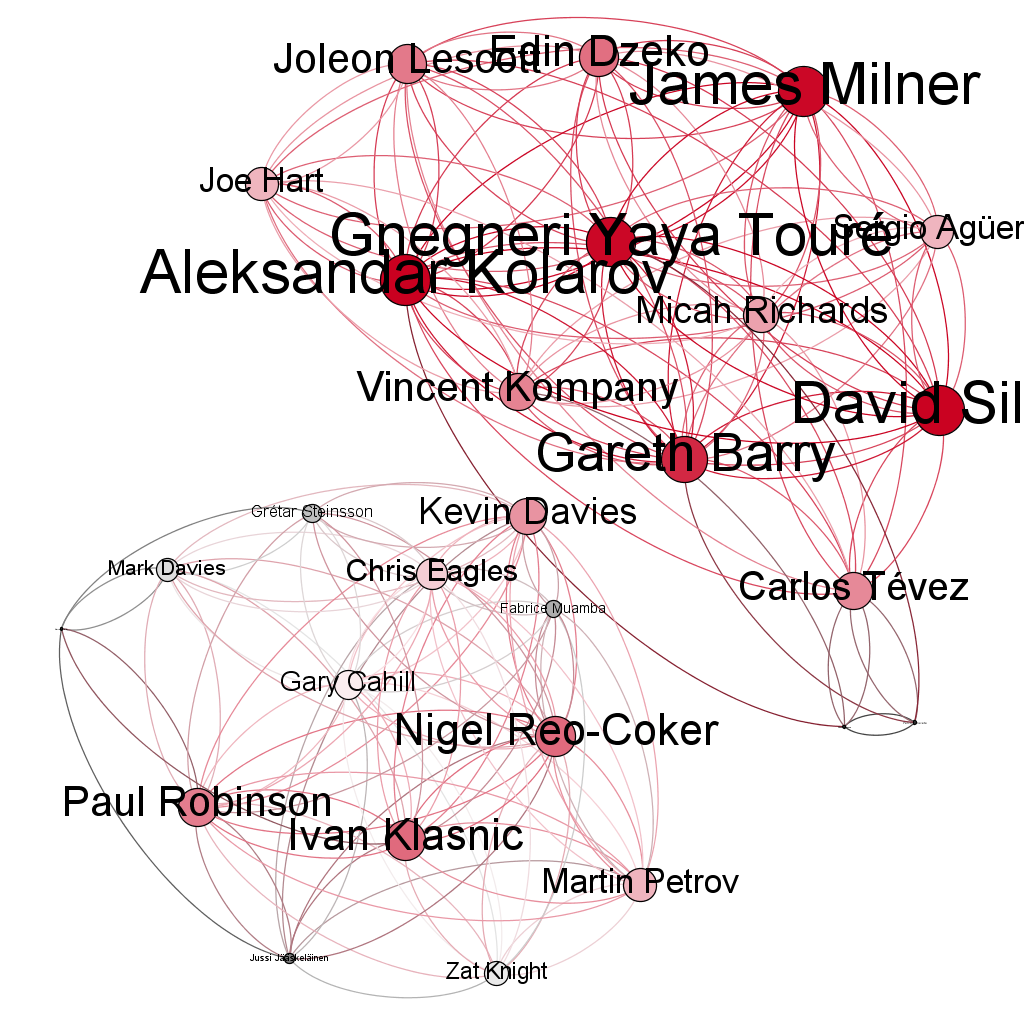
Ever since getting my hands on some Opta data, courtesy of Manchester City’s Analytics challenge all the way back in August 2012, I’ve been wanting to try something different with the data. Although it’s taken me over a year to get around to doing it, I’d initially thought of the idea of doing some kind of Network Graph to explore how the players were interconnected throughout a match, and potentially over an entire season. Since starting to play with Gephi some time ago, I figured it would be perfect for the job.
read more
The other week, Microsoft announced GeoFlow for Excel 2013 at the SQL PASS Business Analytics conference in Chicago. While it’s not exactly new, it is at least, a pretty impressive looking addition to the data visualisation toolkit.
However, while GeoFlow finally brings 3D geographical visualisation to Microsoft’s self-service BI utility belt (in your face, Batman), it’s hard to make a case for it for any purpose except wowing executives and potential clients.
read moreLove them or hate them, there’s no escaping infographics these days. They are EVERYWHERE. Personally, I’m a fan. I’ve always been interested in visualisation techniques and better ways to represent data visually. After all, the human brain can process images and patterns much faster than it can text. The best visualisations are the ones that need no explanation, while the worst are the ones that basically just overlay some text or numbers on some graphics and still make you read the content to understand what’s going on. Even then though, I’m a sucker for a nice infographic (yes, event the overly textual ones).
Anyway, the point of this post was to show off a little infographic that I received from Xbox LIVE Rewards the other day to celebrate 10 years of Xbox LIVE, and illustrate my contribution to that:
read more
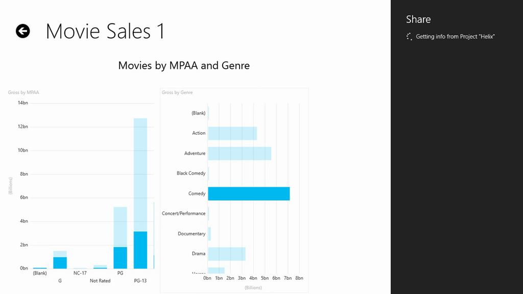
Some pretty interesting information leaked out of last week’s SharePoint Conference 2012 regarding Microsoft’s upcoming Mobile BI (Business Intelligence) solution. There’s been surprisingly little reaction to the unveiling of the solution, apparently codenamed “Project Helix”, perhaps due to the fact that it was unveiled at a SharePoint event and not a SQL Server one. However, courtesy of one attendee tweeting some screenshots to SSAS guru Chris Webb, this little nugget of information landed in my inbox this morning and immediately piqued my interest. Unfortunately there’s very little information available on “Project Helix” at the moment, but from the 2 screenshots provided by attendee Just Blindbaek, there are a few things that are immediately apparent, and a couple more that can be reasonably inferred:
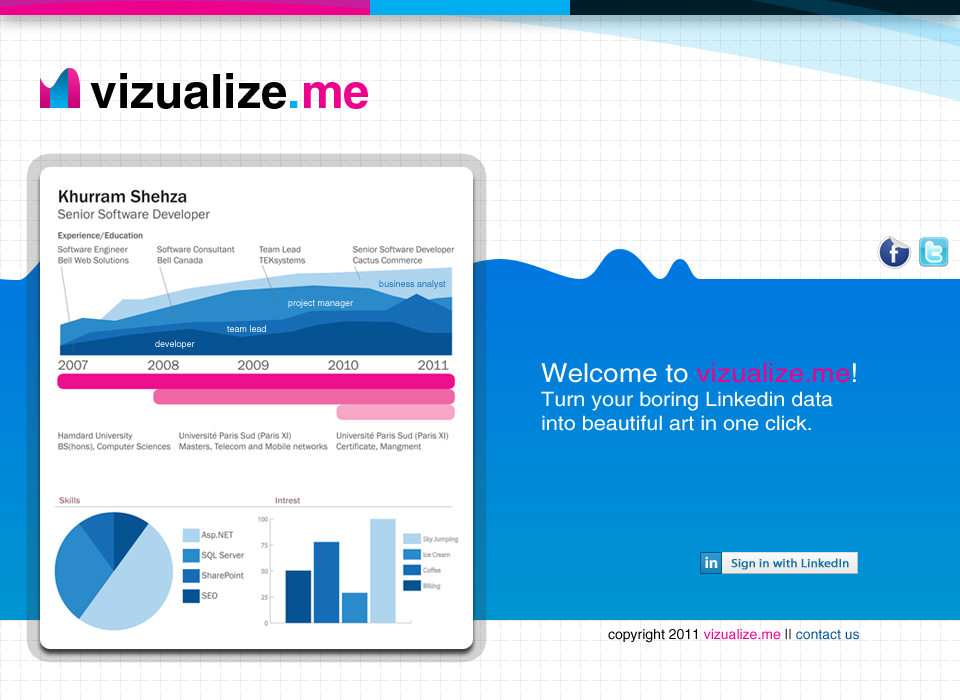
read moreA couple of months ago I posted an article titled Vizualize.Me - your CV as an infographic in a single click, regarding an interesting new visualisation service which, using data from your LinkedIn profile can generate an entire, graphical representation of your CV in a single click. At the time of writing the post, the service was gearing up to launch their private beta, with a public beta soon to follow. Unfortunately, I didn’t quite make the cut for the private beta but the public beta is now live! So, I’ve been straight in and created a visualisation of my CV (below) from my LinkedIn profile.
read more
Vizualize.Me are gearing up to launch their infographic resume (CV to you and me) over the coming months. The private beta is due to kick off in July, with a public beta soon to follow at the beginning of August. This innovative service takes your LinkedIn profile data and turns it into a collage of charts, visualisations and colours encompassing your employment history, qualifications and skills, all in a single click.
read more