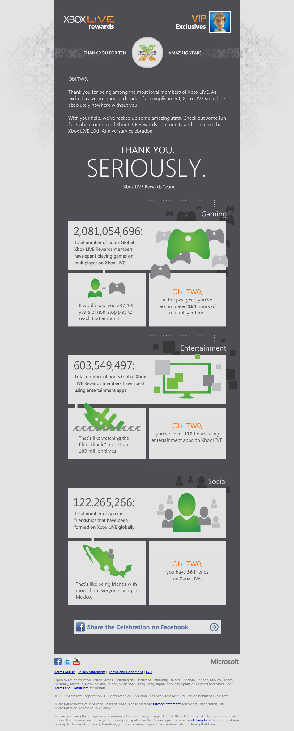
10 Years of Xbox LIVE Infographic
Love them or hate them, there’s no escaping infographics these days. They are EVERYWHERE. Personally, I’m a fan. I’ve always been interested in visualisation techniques and better ways to represent data visually. After all, the human brain can process images and patterns much faster than it can text. The best visualisations are the ones that need no explanation, while the worst are the ones that basically just overlay some text or numbers on some graphics and still make you read the content to understand what’s going on. Even then though, I’m a sucker for a nice infographic (yes, event the overly textual ones).
Anyway, the point of this post was to show off a little infographic that I received from Xbox LIVE Rewards the other day to celebrate 10 years of Xbox LIVE, and illustrate my contribution to that:

Xbox LIVE celebrates its 10th birthday in style!
There’s nothing like a little bit of data mining to get the brain going, and when that brings gaming into the whole data-sphere, there was no way I could avoid being interested. Being the data visualisation geek that I am, I couldn’t help but smile at this. Nice touch Microsoft!