Visualising a football match as a Network Graph using Gephi
Ever since getting my hands on some Opta data, courtesy of Manchester City’s Analytics challenge all the way back in August 2012, I’ve been wanting to try something different with the data. Although it’s taken me over a year to get around to doing it, I’d initially thought of the idea of doing some kind of Network Graph to explore how the players were interconnected throughout a match, and potentially over an entire season. Since starting to play with Gephi some time ago, I figured it would be perfect for the job.
Preparing the Data
The supplied Opta data consisted of two XML files, one containing details of the teams, players, officials and venue for the match, the other an extensive record of match events. I decided to convert these to JSON as well, to give myself some more options in future for visualising the data (there are plenty of JavaScript based visualisation plugins out there that run off JSON data). I had a little fiddle around with MongoDB, but since the data was in a pretty well structured format, and I’d need structured data to load into Gephi, I decided to create a matching schema in SQL Server and load the data into there. I could have used Excel with Power Query, or SSIS to import the data, but as it was just a quick one-off, I knocked up a little .NET application to perform the ETL, using the amazingly easy Simple.Data to load the data into the database.
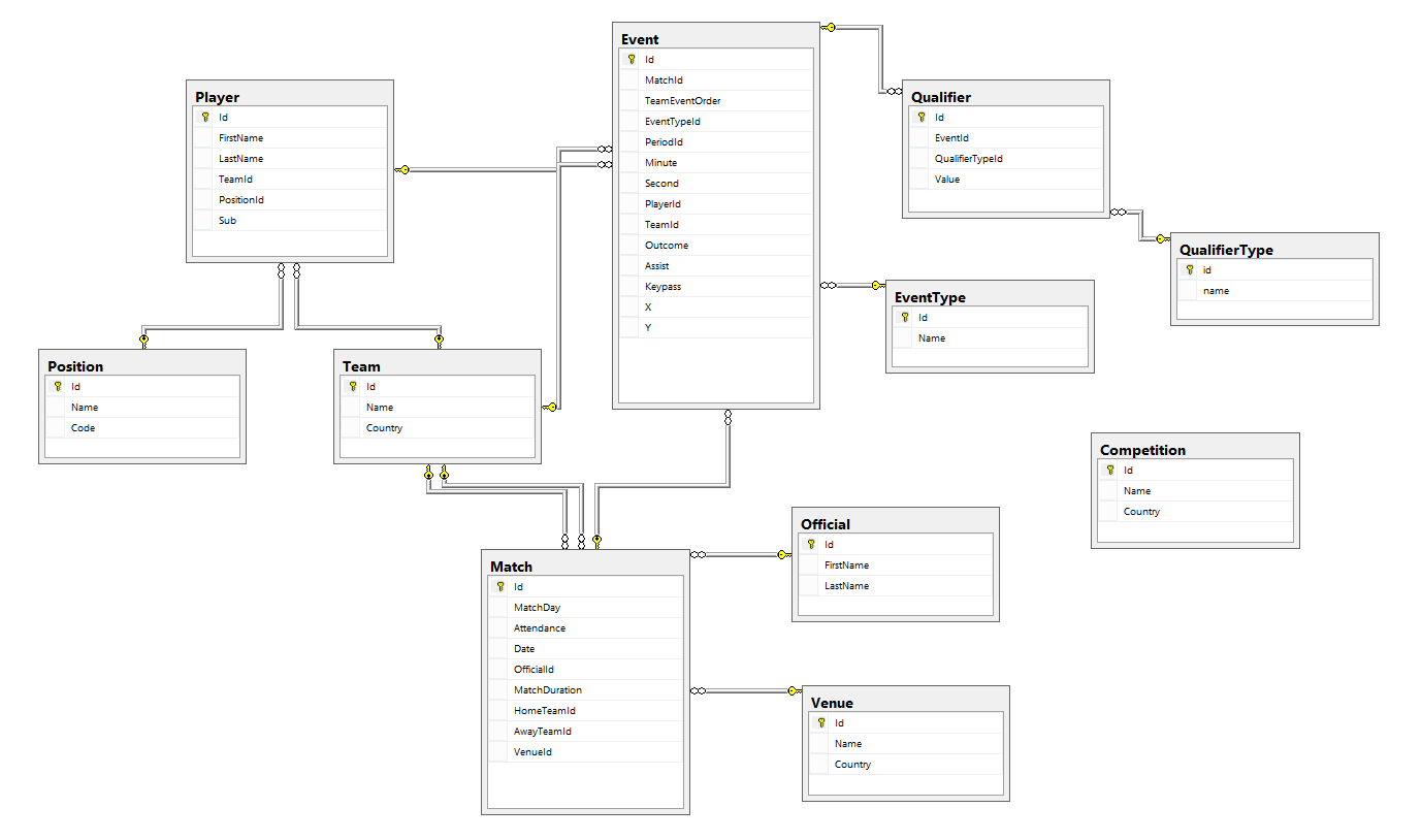
This ERD shows how I structured the match data in SQL Server.
This structure should be flexible enough to allow me to expand this solution to cover more Opta files, and eventually run this analysis over an entire season, or potentially across a large number of leagues. For my single match example though, once I’d loaded the data into SQL Server, it was then simply a case of identifying what I wanted to use as my nodes and edges, and writing a query to export the data into text files, ready for importing to Gephi.
Importing to Gephi
Importing data to Gephi is, fortunately, very simple. As long as you have a couple of delimited text files (one each for nodes and edges), with the correct columns, Gephi can import it and you can generate a network diagram in seconds.
Given that I was examining football players and passes, it made sense to configure my data in the following way. A node file, containing all the players:
| NodeId | NodeName |
|---|---|
| 1 | Joe Hart |
| 2 | Aleksandar Kolarov |
| 3 | Joleon Lescott |
| 4 | Vincent Kompany |
| 5 | Micah Richards |
And an edges file, containing details of all the passes from player to player, whether they led to a goal (Assists), whether they set up an important event (KeyPasses), and the number of passes between any combination of players (Weight):
| SourceNodeId | TargetNodeId | Assists | KeyPasses | Weight |
|---|---|---|---|---|
| 1 | 5 | 1 | 9 | |
| 1 | 2 | 2 | 10 | |
| 2 | 3 | 6 | ||
| 3 | 4 | 1 | 4 | |
| 4 | 2 | 1 | 2 | 7 |
From Gephi, you can simply go to the “Data Laboratory” tab and select the “Import Spreadsheet” option to import your files and map the relevant columns. Remember that since it’s Java, if you’ve got a text file created on Windows in UTF-8, you’ll need to remove the Byte Order Mark first. It’s a pet peeve of mine when applications can’t handle this, given that it’s such a common feature.
Visualising the Network
Once the data’s all imported, you can start mucking about with create your network graph. This is the fun part of Gephi, where you get to experiment with different classifiers and algorithms, to find different ways of analysing your data. I’m still quite new to a lot of the techniques, but there’s a great explanation of each available measure over on the Gephi wiki.
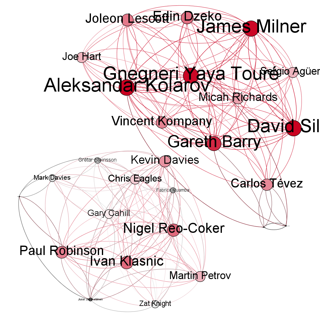
I decided to make a couple of simple visualisations to begin with, rather than digging too much. The first shows a simple network graph, where node size and colour is determined by the number of completed passes by a player, and the weight of the edges just by the assigned weight from the file (number of times the player passed to the same target).
Graph visualisation based on number of completed passes.
As is to be expected, the players with the most passes (David Silva, James Milner, and Yaya Touré) appear the brightest and largest, and the directionality on the edges allows you to see who each player passed to the most. Funnily enough, it’s all Man City, who ran eventually sealed a dramatic 3-2 win. Bolton’s players don’t show incredibly well, since the data is not scaled to each individual team. You can tell by the size and colour of the nodes, representing completed passes, and the colour and thickness of the edges, representing the number of passes between two players (nodes). You can also explore the shortest path between two nodes, allowing you to examine the most likely route a player takes to indirectly get the ball to another player (i.e. not the immediate target).
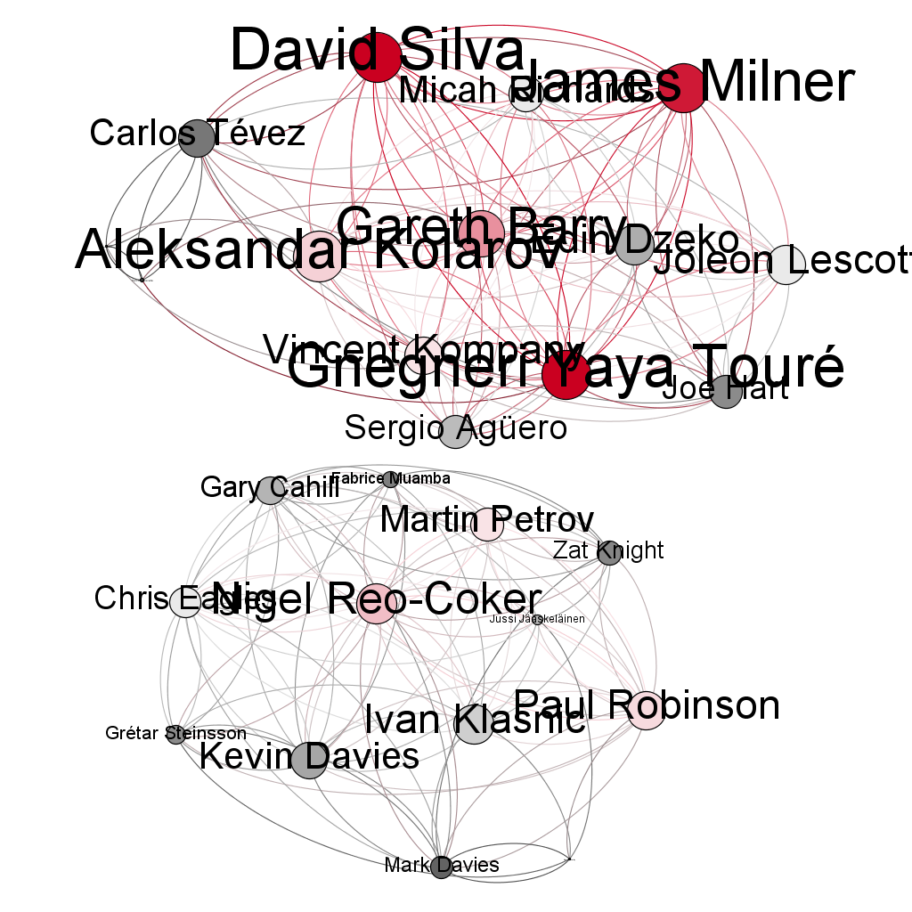
This is a pretty simple example, so I thought I’d also experiment with using a different method to analyse the nodes. I reckoned it would be worth trying it based on the Eigenvector Centrality, which establishes the most important elements of a community by their relative importance compared to surrounding nodes. I theorised that this would let me establish the most important players in the match, based on their connection to the nodes around them. In theory, this should pull out the players who are the most connected to the largest nodes from the first visualisation.

Graph visualisation using Eigenvector Centrality to establish relative importance of each player.
As you can see from the second diagram, this has the effect of pulling out Kolarov and Barry as two pivotal figures for Man City, due to their connection to our highest ranked passers: Silva, Milner, andTouré. For Bolton, since Eigenvector Centrality takes its authority from related nodes, we can finally see some impact, with Paul Robinson, Ivan Klasnic, and Nigel Reo-Coker being highlighted.
Conclusions
I’m still learning a lot of the analysis techniques and algorithms related to network visualisation, but I thought this would be a good, simple example of some of the things that can be done with any type of community. For all the football data that I’ve seen visualised (one of my colleagues has made an extremely neat animated pitch, showing the entire match, Football Manager style), I’d never seen anyone try a network graph, so I thought I’d give it a bash. These are some pretty simple graphs and basic conclusions, but I’m going to try and take this further, by throwing in more games, and analysing an entire season, as well as exploring the different classification algorithms available in Gephi.
If you’ve done a lot of work with network graphs, or you know of other techniques that would be worth a shot, I’d love to hear from you in the comments below. Likewise, if you’ve ever had a go at anything similar. It’s been a lot of fun playing with Opta’s data, and I’m looking forward to seeing what else I can come up with.