GeoFlow brings 3D geographical visualisation to Excel 2013

The other week, Microsoft announced GeoFlow for Excel 2013 at the SQL PASS Business Analytics conference in Chicago. While it’s not exactly new, it is at least, a pretty impressive looking addition to the data visualisation toolkit.
However, while GeoFlow finally brings 3D geographical visualisation to Microsoft’s self-service BI utility belt (in your face, Batman), it’s hard to make a case for it for any purpose except wowing executives and potential clients.
GeoFlow Cons
There’s no denying it looks cool, but:
- It needs a dedicated graphics card to really work, not something that can be relied upon in this world of tablets, netbooks and mobile computing.
- It can be hard to derive insight, given that you can only see half the globe at any one time. For more effective global visualisation, why not use the map visualisation in PowerView in Excel 2013?
- It can’t be used with Sharepoint, and it doesn’t really fit into Microsoft’s new self-service BI model (great point, courtesy of MSBI guru Jamie Thomson - check his thoughts on his blog).
- There are a few constraints/oversights still to be dealt with:
- It can’t handle a PowerPivot data model containing hidden columns (“hide from client tools” option).
- There doesn’t seem to be much control over visualisations and effects. The effects don’t behave quite as expected, and you need to spend a lot of time faffing about with transition duration and effect duration to get things going. Plus, you only have three types of visualisation:
- Column (stacked/clustered)
- Bubble (i.e. pie chart)
- Heatmap
Pros of GeoFlow
Now, excuse me if it sounds like I don’t like GeoFlow. I do.
- It’s definitely got the wow factor, and the first time you put a GeoFlow “Tour” together, it’ll be like the first time you mashed some ad-hoc data into PowerPivot, and built a nice visualisation using PowerView in a matter of seconds. Executives and marketing folks are bound to like it, for the sheer fact that it looks great, moves in 3D, and can display data changing over time.
- Speaking of time, I can imagine where this COULD go. With a few more visualisation options, it could be used for some great geospatial vs time animations (if you’ve seen Indiana Jones, I’m thinking about when he jumps on a plane and you see the line travelling across the map). Imagine seeing a Twitter conversation in real-time, moving across the globe joining the dots between participants. Or the spread of a flu epidemic., or tracking a package as it traverses the logistics network. There are a lot of opportunities for expansion, this is just a very basic time vs location one.
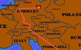
The famous Indiana Jones map visualisation
Try it out
For the time being, it’s definitely worth downloading GeoFlow for yourself and having a play. Like a lot of the recent MSBI tools, it’s got potential to be something more, but I get the feeling that they’ve started with an initial release and will roll out more features with each subsequent version (think of the changes in PowerView between the initial SQL Server 2012 release and the Excel 2013 version).
I love that Microsoft are releasing stuff like this though, and it shows that they’re looking at lots of different angles when it comes to their BI offering. If they can manage to keep everything in-line and consistent, they’ll have an incredible toolkit for BI. They’re almost there: PowerPivot/PowerView in Excel 2013 is now my go-to toolkit for doing a quick data-model or proof of concept. They just need to shore up some of these great ideas to make them compelling.
Let me know in the comments below if you’ve tried GeoFlow, and what your thoughts are. Are you using it for anything serious? What do you think is good or bad about and where can Microsoft take it next?